Zona Zero, Embracing
a Lifestyle
Type of Project
UX/UI Challenge
Company
Zona Zero
Industry
Clothing & Outdoor Sports
Platform
E-commerce
My Role
UX/UI Designer
Timeline
48hs | May 2024

Approach
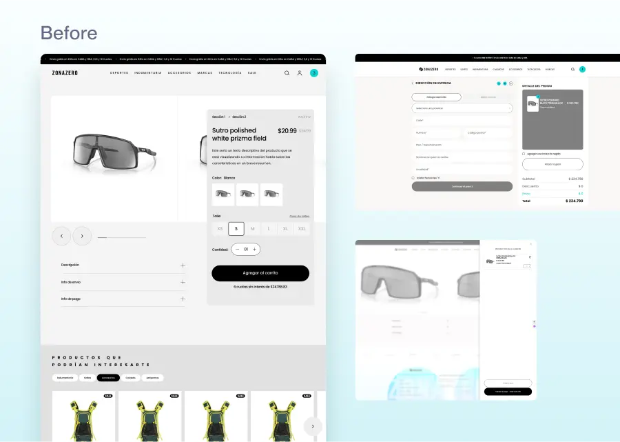
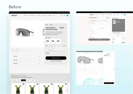
For this challenge, I aimed to redesign the purchase flow of the Zona Zero platform. Following the brief, I implemented changes to enhance both the user experience and the visual appeal.
My focus was on making the purchase process more intuitive and seamless, while also updating the design to be more attractive and consistent with the platform's identity
I implemented the Design Thinking methodology.
UX Research
The approach to this stage was based on information available online: the company's social media, current website, and competitors.
The research objective was to gather as much information as possible about Zona Zero's customers, the effectiveness of the website’s checkout flow, and potential usability improvements.
Research Insights



Customer Archetype
Customer Archetype
• Individuals with a good economic standing.
• Any gender, but primarily males.
• Aged 16 to 40 years.
• General characteristics: fresh, youthful, modern, sophisticated, sporty, and action-oriented.
• Interests: board and extreme sports, nature, and the outdoors.
• Individuals with a good economic standing.
• Any gender, but primarily males.
• Aged 16 to 40 years.
• General characteristics: fresh, youthful, modern, sophisticated, sporty, and action-oriented.
• Interests: board and extreme sports, nature, and the outdoors.
Benchmarking
Benchmarking


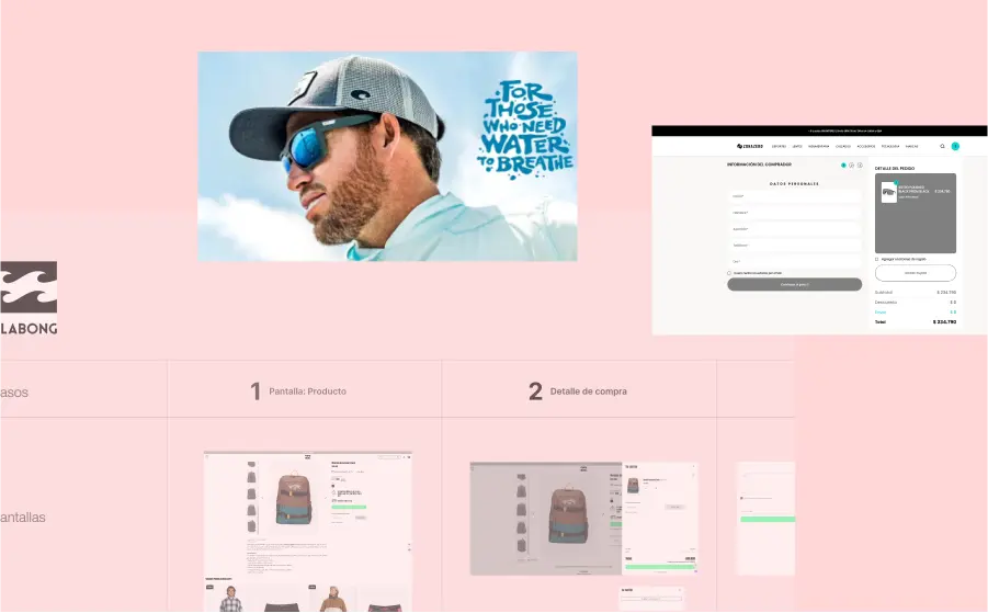
I analyzed the purchase flows of three direct competitors to conduct a comparative analysis that could reveal opportunities for improving the Zona Zero flow. In this regard, I identified some enhancements, for example: Add suggested products to the purchase once the user begins the checkout process.
I analyzed the purchase flows of three direct competitors to conduct a comparative analysis that could reveal opportunities for improving the Zona Zero flow. In this regard, I identified some enhancements, for example: Add suggested products to the purchase once the user begins the checkout process.


Heuristic Evaluation (UX Audit)
Structures
Structures
I found ways to improve visual organization and navigation, making the experience better and less mentally taxing. For example, replacing the dropdown boxes with tabs, cleaned up the visuals, and improved how slide photos are shown.
I found ways to improve visual organization and navigation, making the experience better and less mentally taxing. For example, replacing the dropdown boxes with tabs, cleaned up the visuals, and improved how slide photos are shown.
UX Writing
UX Writing
The website's voice and tone are inconsistent, swinging between formal and informal. I propose improving consistency by using an informal voice with a neutral tone, fitting the user profile.
The website's voice and tone are inconsistent, swinging between formal and informal. I propose improving consistency by using an informal voice with a neutral tone, fitting the user profile.
Revamp of the Look & Feel
Revamp of the Look & Feel
The current UI is functional and industry-aligned, but I suggested a new user-focused interface. The goal was to create a modern, friendly, and sophisticated design that feels fresh and cool.
The current UI is functional and industry-aligned, but I suggested a new user-focused interface. The goal was to create a modern, friendly, and sophisticated design that feels fresh and cool.
UI Design Process
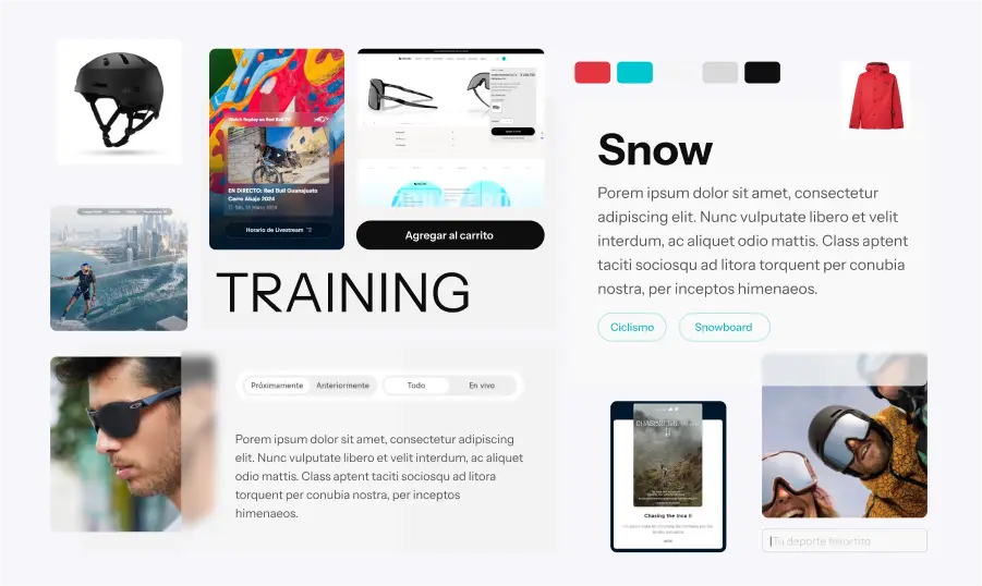
• After the research phase, I created a moodboard to align with the brand identity and the user's personality, tastes, and interests.
• The following step, was to develop high-fidelity wireframes, aiming to balance functionality, efficiency, usability, and visual appeal.
• I designed a UI Kit encompassing all components, color palette, layout grid, spacing system, typography, and styles.
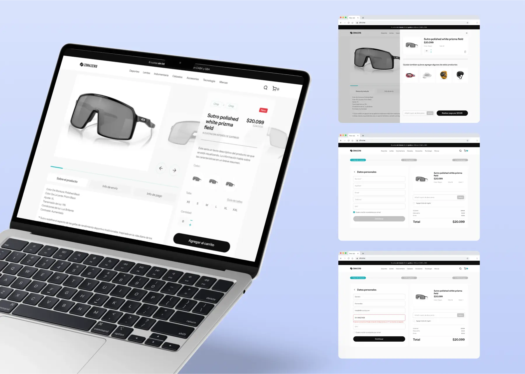
Final UI
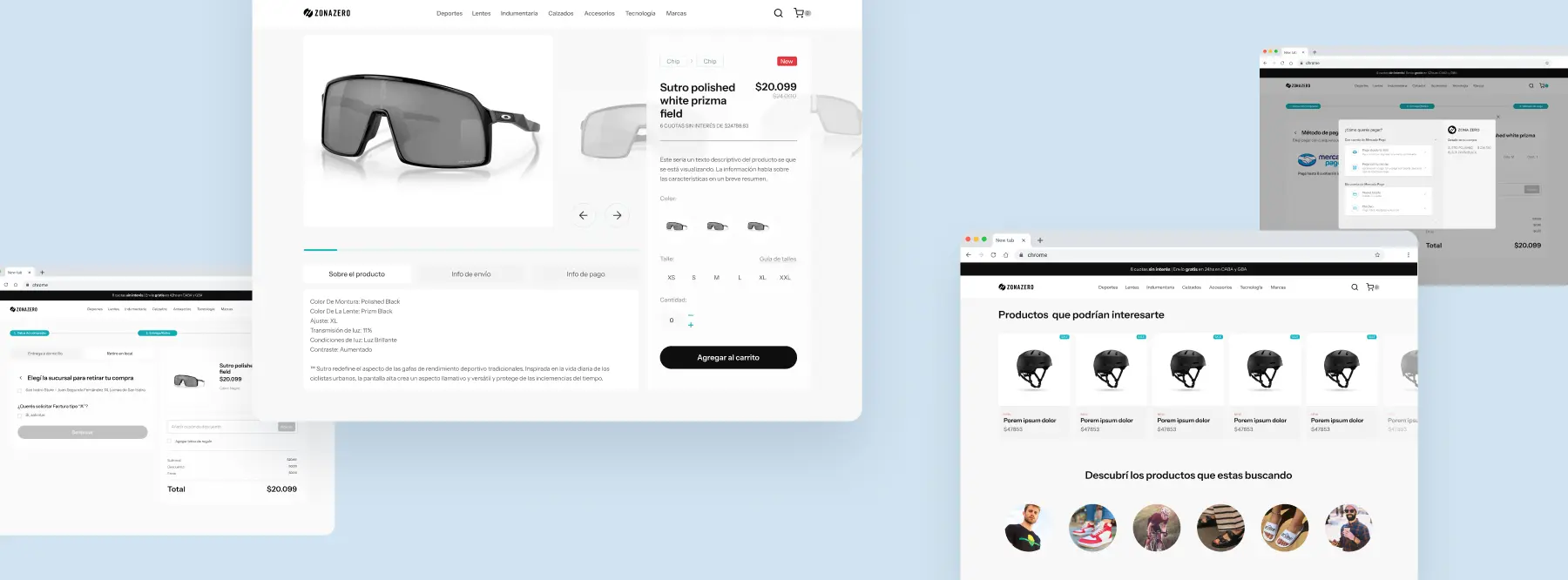
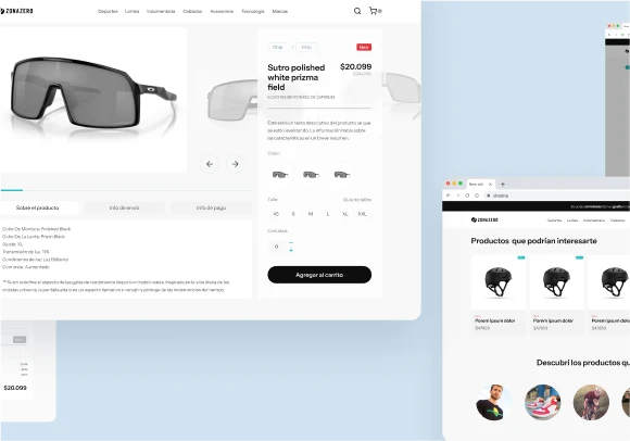
The final step was to create a desktop prototype with micro-interactions, showcasing the new look along with the relevant interactions.
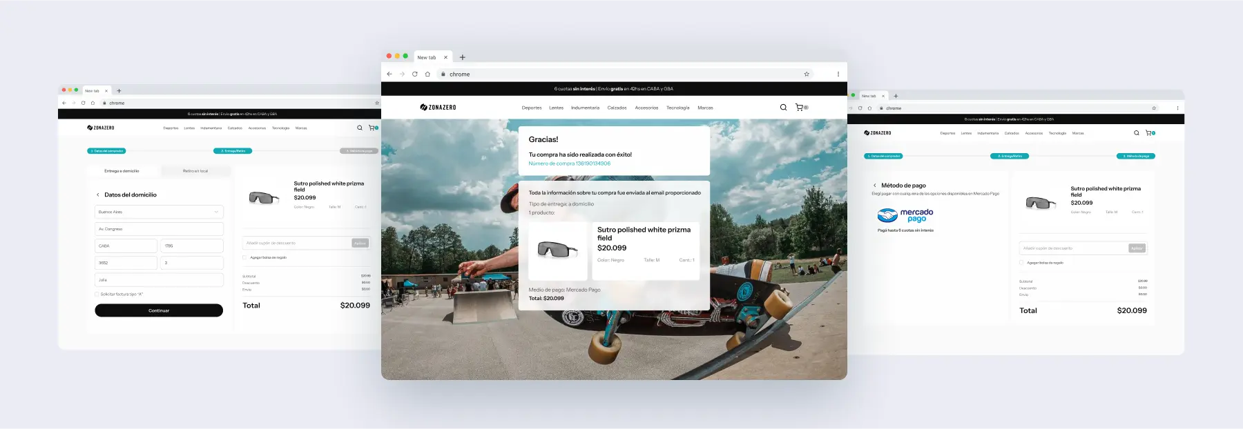
Prototype
Test the prototype by yourself
Zona Zero, Embracing
a Lifestyle


Type of Project
UX/UI Challenge
Industry
Clothing & Outdoor Sports
Company
Zona Zero
My Role
UX/UI Designer
Timeline
48hs | May 2024
Platform
E-commerce

Approach
The request for this project was to redesign the website for Capital Cars, a luxury transportation company from the UK. The main goal was to create a more modern, attractive, and user-friendly site that introduces the company and makes it easy for customers to schedule appointments

Research & Structure
I started the research stage by crafting a survey with the objective of fully understanding the needs and current common uses of the target audience. I also conducted desktop research to gather valuable information about the current regulations and statistics of digital wallets in the area. In this phase, I also created a benchmarking analysis of the main direct competitors.
Additionally, I performed a full heuristic analysis of the already developed MVP to identify features and elements that we could change, add, or remove for the next enhanced version.

Research Insights



Customer Archetype
• Individuals with a good economic standing.
• Any gender, but primarily males.
• Aged 16 to 40 years.
• General characteristics: fresh, youthful, modern, sophisticated, sporty, and action-oriented.
• Interests: board and extreme sports, nature, and the outdoors.



Benchmarking
I analyzed the purchase flows of three direct competitors to conduct a comparative analysis that could reveal opportunities for improving the Zona Zero flow. In this regard, I identified some enhancements, for example: Add suggested products to the purchase once the user begins the checkout process.

Heuristic Evaluation (UX Audit)
Structures
I found ways to improve visual organization and navigation, making the experience better and less mentally taxing. For example, replacing the dropdown boxes with tabs, cleaned up the visuals, and improved how slide photos are shown.
UX Writing
The website's voice and tone are inconsistent, swinging between formal and informal. I propose improving consistency by using an informal voice with a neutral tone, fitting the user profile.
Revamp of the Look & Feel
The current UI is functional and industry-aligned, but I suggested a new user-focused interface. The goal was to create a modern, friendly, and sophisticated design that feels fresh and cool.

UI Design Process
After the research phase, I created a moodboard to align with the brand identity and the user's personality, tastes, and interests.
The following step, was to develop high-fidelity wireframes, aiming to balance functionality, efficiency, usability, and visual appeal.
I designed a UI Kit encompassing all components, color palette, layout grid, spacing system, typography, and styles.
Final UI
The final step was to create a desktop prototype with micro-interactions, showcasing the new look along with the relevant interactions.


Prototype
Test the prototype by yourself
