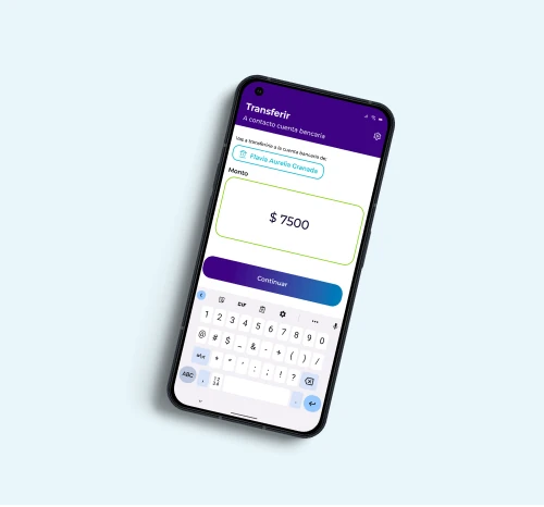
Bivo, a digital wallet for the everyday
Client
CrediSí
Industry
Fintech: Digital Wallet
Platforms
Android | iOS | Web App
My Role
UX/UI Designer
Timeline
June 2022 - July 2022

Approach
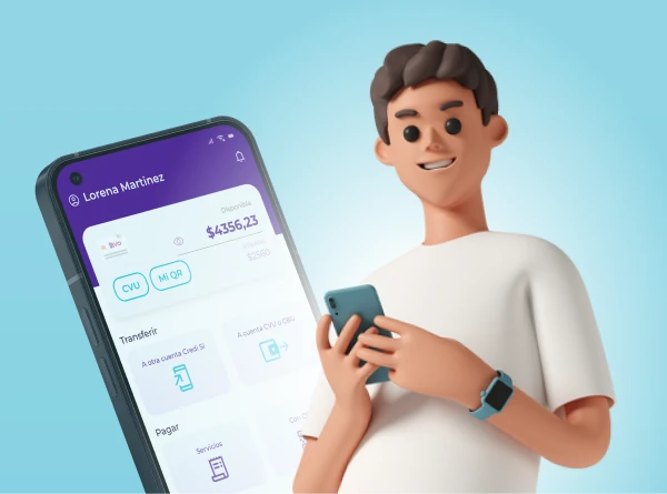
For this project, I was hired as a freelancer, solely responsible for the UX/UI design. The challenge was to design the user experience, part of the architecture, and the app interface almost from scratch.
A significant part of the MVP was already developed but had many shortcomings in all the aforementioned aspects. Therefore, I decided to approach the project as a new design rather than a redesign since it was necessary to re-establish many features. To achieve this, I utilized the Design Thinking methodology, which helped me structure the stages of the process to focus on the user and their needs.
UX Research
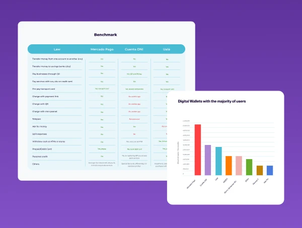
I started the research stage by crafting a survey with the objective of fully understanding the needs and current common uses of the target audience. I also conducted desktop research to gather valuable information about the current regulations and statistics of digital wallets in the area. In this phase, I also created a benchmarking analysis of the main direct competitors.
Additionally, I performed a full heuristic analysis of the already developed MVP to identify features and elements that we could change, add, or remove for the next enhanced version.
Insights and Conclusions
The most relevant information that helped us guide our decisions
From the surveys, we identified that the most frequently used functions are (in order):
Transfers
Service payments
Payments with QR code
Pre-pay transport card and cell phone
View account status and transfer movements
This insight helps us prioritize which features should have more relevance than others.



The most relevant insight from the benchmarking analysis:
Regarding functionalities, all the analyzed apps have very similar features, with only minor differences that are not very innovative. None of the analyzed apps offer NFC payments, so including this feature would provide a functional advantage and serve as a key differentiator in our value proposition.
The heuristic analysis provided detailed insights into the usability issues:
The visual aspect of the app did not adhere to any design patterns, making it neither accessible nor navigable.
Additionally, it lacked a look and feel that would provide desirability.
This conclusion led us to understand that we had to design the UX/UI from scratch.
User Personas
We have three different user personas.
Andrés
Buenos Aires, 27 years old. Filmaker
User Persona 1

Motivations
It motivates you to learn things that you can apply practically and simply.
He enjoys finding quick solutions through technology.
They do not want to waste time on issues like collections, transfers, or payments.
Frustrations
Remind your clients to pay their fees.
Avoid wasting time on collecting overdue payments.
Fear of being scammed when using new virtual wallet apps.
Fabiana
Buenos Aires, 30 years old. Manicure
User Persona 2

Motivations
Find solutions quickly and efficiently, without worrying about security.
Focus on each client and give quality to their work.
Have a prosperous business.
Frustrations
Spend a lot of time learning new things that don't give you satisfaction.
Lose customers.
Do not get new benefits when you make a habit change.
Julieta
Misiones, 22 years old. Student and Employe
User Persona 3

Motivations
Having time to enjoy the activities you like to do.
Being able to make purchases online and pay for services without going to payment points.
Frustrations
Having to carry money everywhere and sometimes running out.
Being late with utility payments, or going past the due date.
Not keeping track of your expenses.
Andrés
Buenos Aires, 27 years old. Filmaker
User Persona 1

Motivations
It motivates you to learn things that you can apply practically and simply.
He enjoys finding quick solutions through technology.
They do not want to waste time on issues like collections, transfers, or payments.
Frustrations
Remind your clients to pay their fees.
Avoid wasting time on collecting overdue payments.
Fear of being scammed when using new virtual wallet apps.
Fabiana
Buenos Aires, 30 years old. Manicure
User Persona 2

Motivations
Find solutions quickly and efficiently, without worrying about security.
Focus on each client and give quality to their work.
Have a prosperous business.
Frustrations
Spend a lot of time learning new things that don't give you satisfaction.
Lose customers.
Do not get new benefits when you make a habit change.
Julieta
Misiones, 22 years old. Student and Employe
User Persona 3

Motivations
Having time to enjoy the activities you like to do.
Being able to make purchases online and pay for services without going to payment points.
Frustrations
Having to carry money everywhere and sometimes running out.
Being late with utility payments, or going past the due date.
Not keeping track of your expenses.
MVP
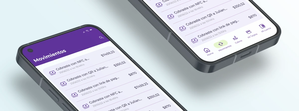
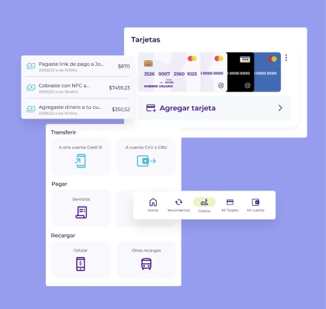
Defining the features
Essential Features
(V.1.0)
• Profile: Basic user data
• Transfers: To digital wallets and savings banks
• View account balance and transaction history
• Charge via QR code
• Charge via payment link
• Cash withdrawal
• Differentiating functionality: Charge via NFC
Tangible product: Pre-paid Bivo card
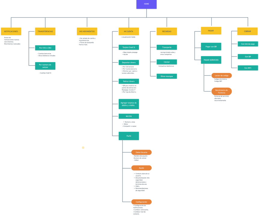
After implementing a card sorting exercise with 25 users, we determined the categories and classifications of the app features. The following is the defined Information Architecture:
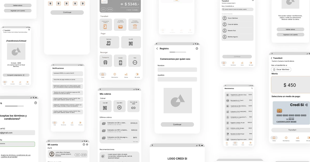
Wireframes
Usability Test
After designing the wireframes for the main tasks, we conducted a usability test with 5 people from the target audience.
What and how was tested?
Functional prototype in Media Modality
The tests are conducted remotely with 4 sessions including a moderator, observer, and user.

Results
3 out of 4 users rated their satisfaction
level as 5.
The issues were not serious, but 4 out of 5 users spent considerable time on a specific task, particularly in the card or NFC scan selection section (external to the app).
100% of the users...
Encountered confusion with NFC charging.
Successfully completed all tasks.
Provided positive feedback on the functionalities, navigation, and findability.
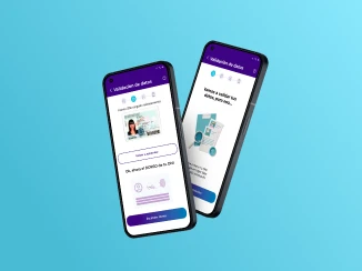
Usability Test Conclusions
Users found the prototype ‘‘clear, accessible, understandable, useful, and easy to use’’ in most cases and tasks, performing fluidly and agilely during processes, information retrieval, and navigation. The prototype will be iterated to enhance NFC-related payments.
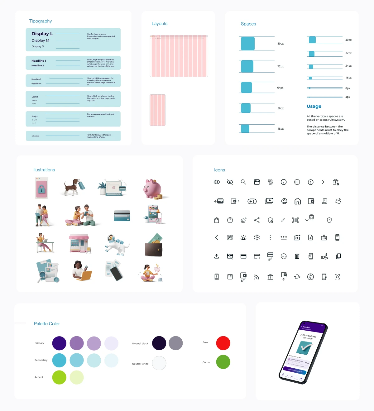
UI Design System
Style Guide
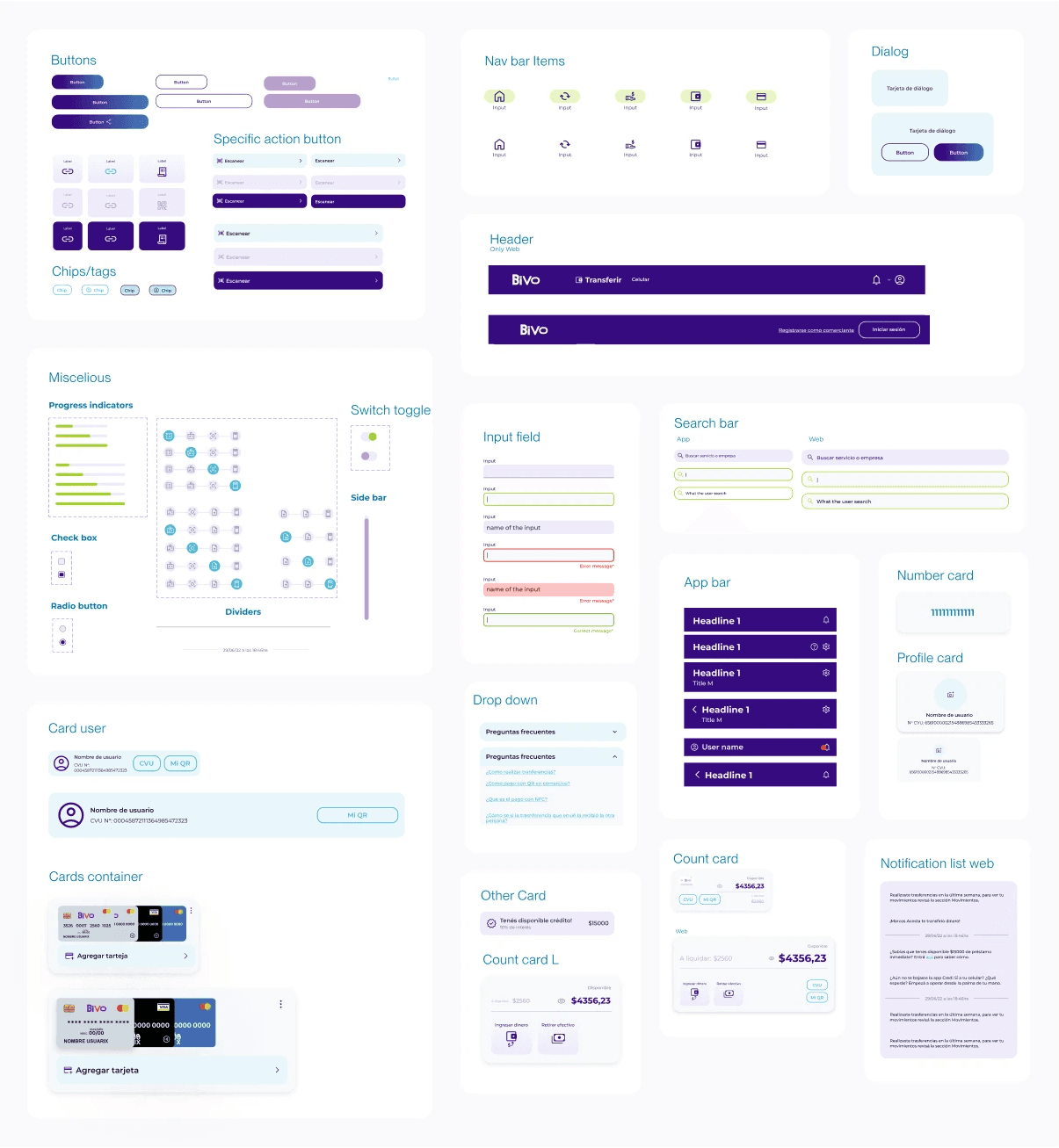
Components
Final Functional Prototype

Bivo, a digital wallet for the everyday

Client
CrediSí
Industry
Fintech: Digital Wallet
Platform
Android, iOS, Web App
My Role
UX/UI Designer
Timeline
June 2022 - July 2022


Approach
For this project, I was hired as a freelancer, solely responsible for the UX/UI design. The challenge was to design the user experience, part of the architecture, and the app interface almost from scratch.
A significant part of the MVP was already developed but had many shortcomings in all the aforementioned aspects. Therefore, I decided to approach the project as a new design rather than a redesign since it was necessary to re-establish many features. To achieve this, I utilized the Design Thinking methodology, which helped me structure the stages of the process to focus on the user and their needs.


UX Research
I started the research stage by crafting a survey with the objective of fully understanding the needs and current common uses of the target audience. I also conducted desktop research to gather valuable information about the current regulations and statistics of digital wallets in the area. In this phase, I also created a benchmarking analysis of the main direct competitors.
Additionally, I performed a full heuristic analysis of the already developed MVP to identify features and elements that we could change, add, or remove for the next enhanced version.
Insights and Conclusions
The most relevant information that helped us guide our decisions
From the surveys, we identified that the most frequently used functions are (in order):
• Transfers
• Service payments
• Payments with QR code
• Pre-pay transport card and cell phone
• View account status and transfer movements
This insight helps us prioritize which features should have more relevance than others.


The most relevant insight from the benchmarking analysis:
Regarding functionalities, all the analyzed apps have very similar features, with only minor differences that are not very innovative. None of the analyzed apps offer NFC payments, so including this feature would provide a functional advantage and serve as a key differentiator in our value proposition.
The heuristic analysis provided detailed insights into the usability issues:
The visual aspect of the app did not adhere to any design patterns, making it neither accessible nor navigable.
Additionally, it lacked a look and feel that would provide desirability.
This conclusion led us to understand that we had to design the UX/UI from scratch.
User Persona
We have three different user personas.

User Persona 1
Andrés
Buenos Aires, 27 years old. Filmaker
Motivations
It motivates you to learn things that you can apply practically and simply.
He enjoys finding quick solutions through technology.
They do not want to waste time on issues like collections, transfers, or payments.
Frustrations
Remind your clients to pay their fees.
Avoid wasting time on collecting overdue payments.
Fear of being scammed when using new virtual wallet apps.

User Persona 2
Fabiana
Buenos Aires, 30 years old. Manicure
Motivations
Find solutions quickly and efficiently, without worrying about security.
Focus on each client and give quality to their work.
Have a prosperous business.
Frustrations
Spend a lot of time learning new things that don't give you satisfaction.
Lose customers.
Do not get new benefits when you make a habit change.

User Persona 3
Julieta
Misiones, 22 years old. Student and Employe
Motivations
Having time to enjoy the activities you like to do.
Being able to make purchases online and pay for services without going to payment points
Frustrations
Having to carry money everywhere and sometimes running out.
Being late with utility payments, or going past the due date.
Not keeping track of your expenses.


MVP
Defining the features


Essential Features
(V.1.0)
• Profile: Basic user data
• Transfers: To digital wallets and savings banks
• View account balance and transaction history
• Charge via QR code
• Charge via payment link
• Cash withdrawal
• Differentiating functionality:
• Charge via NFC
Tangible product: Pre-paid Bivo card
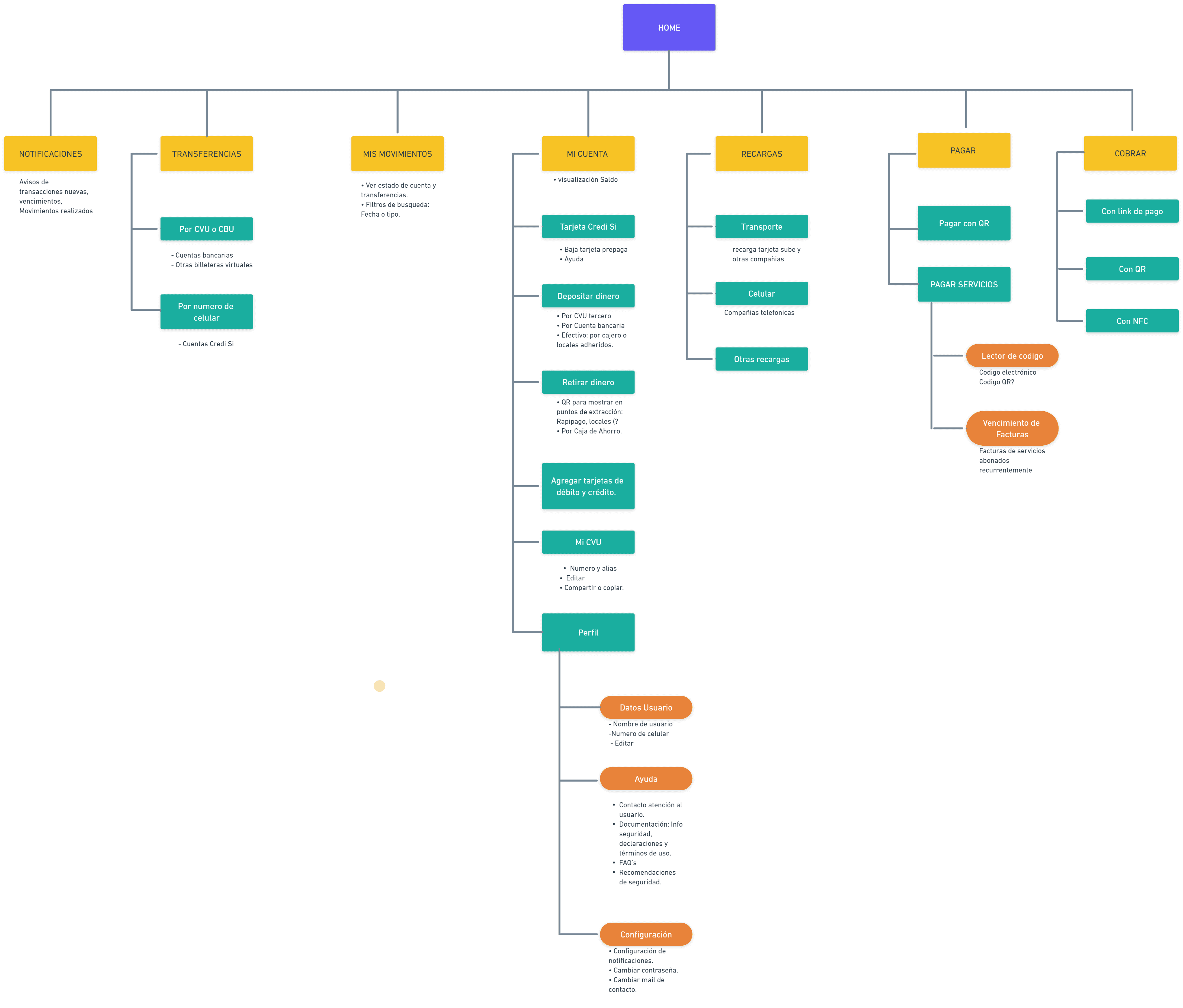
After implementing a card sorting exercise with 25 users, we determined the categories and classifications of the app features. The following is the defined Information Architecture:

Wireframes


Usability Test
After designing the wireframes for the main tasks, we conducted a usability test with 5 people from the target audience.
What and how was tested?
Functional prototype in Media Modality
The tests are conducted remotely with 4 sessions including a moderator, observer, and user.
Results
3 out of 4 users rated their satisfaction level as 5
The issues were not serious, but 4 out of 5 users spent considerable time on a specific task, particularly in the card or NFC scan selection section (external to the app).
100% of the users...
• Encountered confusion with NFC charging.
• Successfully completed all tasks.
• Provided positive feedback on the functionalities, navigation, and findability.


Usability Test Conclusions
Users found the prototype ‘‘clear, accessible, understandable, useful, and easy to use’’ in most cases and tasks, performing fluidly and agilely during processes, information retrieval, and navigation. The prototype will be iterated to enhance NFC-related payments.
UI Design System


Style Guide
Components


Final Functional Prototype
